
How to Read Candlestick Charts: A Beginner's Guide for IPO Investors in India
By IPO Plus
Learn how to read a candlestick chart for beginners, crucial for IPO investors in India. Understand patterns, body, wicks, and colors to track stocks.
How to Read Candlestick Charts: A Beginner's Guide for IPO Investors in India
Key Takeaways
- Candlestick charts visually represent open, high, low, and close prices, offering an immediate grasp of market sentiment, essential for volatile IPO markets.
- The body of a candlestick indicates the open-to-close price range, while wicks show the period's highest and lowest prices, with color (green/red) signaling price increase or decrease.
- Recognizing common patterns like Hammer, Engulfing, and Doji helps identify potential bullish or bearish reversals and market indecision.
- For IPO investors, candlestick analysis can aid in identifying crucial entry and exit points for newly listed stocks, especially when combined with volume and other indicators.
- Practice with demo accounts, consult reputable learning resources, and always consider market context and confirmation from other signals to avoid misinterpretations and common mistakes.
What are Candlestick Charts and Why Use Them?
What is a Candlestick Chart?
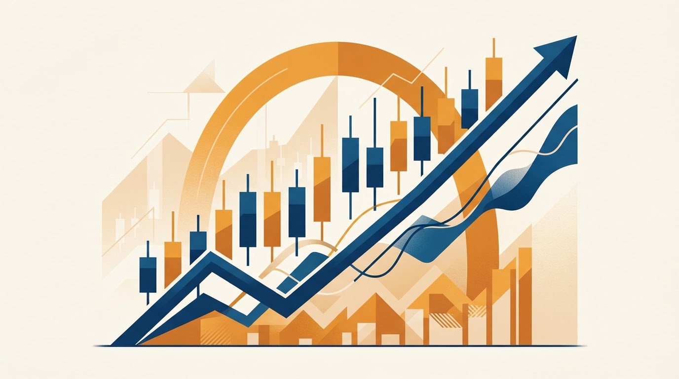
Candlestick charts are a visual representation of price movements for a financial instrument over specific timeframes, originating from Japanese rice merchants in the 17th century. They provide a comprehensive snapshot of market sentiment by displaying the open, high, low, and closing prices as a single 'candlestick.' This graphical method allows traders and investors to quickly grasp price action, enabling them to make informed decisions about buying and selling. The distinct shape and color of each candlestick convey a wealth of information at a glance, making them a popular tool in technical analysis.
A candlestick chart consolidates crucial price information into a single bar for a chosen period, such as a day, week, or hour. Each candle consists of a 'body' and 'wicks' (also known as shadows), which visually depict the price range. The body shows the opening and closing prices, while the wicks indicate the highest and lowest prices reached during that period. This compact visual summary helps investors identify trends, reversals, and momentum, which are vital for understanding market dynamics.
Why are Candlestick Charts Important for IPO Investors?
Candlestick charts are particularly important for IPO investors because they offer early insights into the market's reception of newly listed stocks, which often experience high volatility. For IPO investors in India, understanding how to read a candlestick chart for beginners can provide a significant edge in navigating the initial trading days after an offering. These charts can help identify potential entry and exit points, gauge investor enthusiasm, and predict short-term price direction, especially when fundamental data might still be limited or yet to fully mature. Without this visual aid, investors might struggle to interpret the rapid price swings common in post-listing scenarios.
Candlestick charts differ from other common chart types, such as bar charts and line charts, by providing a more detailed and intuitive visual representation of price action. While bar charts also display open, high, low, and close prices, candlestick charts use a distinct body and color to highlight the relationship between the opening and closing prices, making them easier to interpret visually. Line charts, conversely, only connect closing prices over time, offering a simpler view of trends but lacking the comprehensive detail of price volatility and sentiment that candlesticks provide. The aesthetic appeal and information density of candlestick charts contribute to their widespread preference among technical analysts and traders alike.
How do Candlestick Charts Differ from Other Chart Types?
Understanding the Anatomy of a Candlestick
What do the 'Body' and 'Wicks' Represent?
The complete structure of a candlestick, comprising its body and wicks, tells a detailed story about price activity within a specific trading period. Dissecting these components is fundamental to understanding how to read a candlestick chart for beginners. Every element contributes to illustrating the struggle between buyers and sellers, ultimately reflecting market sentiment.
The 'body' of a candlestick represents the range between the opening and closing prices, while the 'wicks' (or shadows) extending from the body indicate the highest and lowest prices reached during that period. The body is the thick, rectangular part of the candlestick; a long body suggests strong buying or selling pressure, depending on its color, implying significant price movement between the open and close. The wicks, on the other hand, are the thin lines above and below the body, showing the extreme prices touched. A long upper wick signifies that buyers pushed prices up significantly before sellers drove them down, while a long lower wick indicates that sellers pushed prices down before buyers brought them back up.
How Do Colors Indicate Market Movement (Green vs. Red)?
The color of a candlestick instantly conveys whether the price increased or decreased during the period, with green (or white) typically indicating upward movement and red (or black) indicating downward movement. A green (or white) candlestick forms when the closing price is higher than the opening price, signifying that buyers were in control and pushed the price up by the end of the period. Conversely, a red (or black) candlestick forms when the closing price is lower than the opening price, indicating that sellers dominated and drove the price down. The intensity of these colors, or the length of the body, further emphasizes the strength of the market movement.
The open, high, low, and close (OHLC) prices are the four critical data points that define each candlestick and provide a comprehensive overview of price action. The 'open' price is the price at which the first trade took place during the period. The 'high' price is the absolute highest price reached, while the 'low' price is the absolute lowest price reached. The 'close' price is the final price at which the asset traded during the period. For a green candlestick, the bottom of the body denotes the open, and the top denotes the close. For a red candlestick, the top of the body denotes the open, and the bottom denotes the close. The wicks always extend to the high and low prices, regardless of the body's color. These four prices collectively reveal volatility, trend direction, and potential support or resistance levels.
What Do Open, High, Low, and Close Prices Tell You?
Common Candlestick Patterns and Their Meanings
What are Basic Bullish Reversal Patterns (e.g., Hammer, Bullish Engulfing)?
Candlestick patterns are specific formations of one or more candlesticks that visually forecast potential price reversals or continuations, offering valuable insights for traders and investors. Learning to identify these patterns is a key step in understanding how to read a candlestick chart for beginners. These patterns emerge from the collective behavior of market participants, indicating shifts in supply and demand dynamics.
Basic bullish reversal patterns signal a potential shift from a downtrend to an uptrend, indicating that buyers are starting to regain control. The 'Hammer' is a single candlestick pattern with a small body (either green or red) near the top of its range and a long lower wick, typically forming after a downtrend. It suggests that sellers initially drove prices down, but buyers stepped in aggressively to push them back up, indicating potential bullish momentum. The 'Bullish Engulfing' pattern consists of two candlesticks: a small red body followed by a larger green body that completely 'engulfs' the preceding red body. This pattern signals that buyers have significantly overwhelmed sellers, suggesting a strong reversal to an upward trend.
What are Basic Bearish Reversal Patterns (e.g., Hanging Man, Bearish Engulfing)?
Basic bearish reversal patterns indicate a potential shift from an uptrend to a downtrend, signaling that sellers are gaining dominance and may drive prices lower. The 'Hanging Man' is a single candlestick pattern identical in appearance to the Hammer, but it forms after an uptrend. It has a small body (either green or red) near the top of its range and a long lower wick, signaling that despite initial buying pressure, sellers managed to push prices significantly lower, indicating potential bearish sentiment. The 'Bearish Engulfing' pattern is a two-candlestick formation: a small green body followed by a larger red body that completely 'engulfs' the preceding green body. This pattern suggests that sellers have decisively overpowered buyers, indicating a strong reversal to a downward trend.
Doji candlesticks are characterized by a very small or virtually non-existent body, where the opening and closing prices are almost identical, indicating market indecision between buyers and sellers. When a Doji appears, it suggests that neither bulls nor bears were able to gain significant control during the trading period, leading to a stalemate. There are several types of Doji, such as the 'Standard Doji,' 'Long-Legged Doji,' 'Gravestone Doji,' and 'Dragonfly Doji,' each with slight variations in wick length and positioning that can offer nuanced insights into potential reversals or consolidations. The appearance of a Doji, particularly after a prolonged trend, often signals that the market is taking a pause and a potential change in direction could be imminent.
What Do Doji Candlesticks Indicate About Indecision?
How to Integrate Candlestick Analysis with IPO Investing
When Should IPO Investors Look for Candlestick Patterns?
Integrating candlestick analysis into an investment strategy can significantly benefit IPO investors, particularly given the dynamic nature of newly listed stocks. Understanding how to read a candlestick chart for beginners is especially crucial in these volatile environments, where traditional financial metrics may still be developing. Candlesticks provide immediate visual feedback on market sentiment and price action, which can be invaluable when fundamental data is scarce or unreliable.
IPO investors should begin looking for candlestick patterns shortly after a stock lists on the exchange, particularly during the first few days and weeks of trading. This initial period is often characterized by significant price discovery, where investor sentiment is rapidly established and tested. Candlestick patterns formed on daily or even hourly charts during this time can provide early indications of market acceptance, potential support or resistance levels, and emerging trends. Focusing on these early patterns allows investors to react quickly to the market's initial verdict on the IPO.
How Can Candlesticks Help in Identifying Entry and Exit Points for Newly Listed Stocks?
Candlesticks can significantly help in identifying potential entry and exit points for newly listed stocks by highlighting moments of market strength or weakness. For instance, the formation of bullish reversal patterns like a Hammer or Bullish Engulfing after an initial post-listing dip might signal an opportune entry point for investors looking to buy. Conversely, the appearance of bearish reversal patterns such as a Hanging Man or Bearish Engulfing after an initial price surge could indicate a suitable time to consider booking profits or exiting a position. These patterns provide visual cues that can validate or contradict an investor's fundamental analysis, improving timing and potentially overall returns.
Candlestick analysis in volatile IPO markets requires several key considerations due to the unique characteristics of newly listed stocks. Firstly, volume is crucial; candlestick patterns are more reliable when accompanied by high trading volumes, especially during the initial listing days. Secondly, interpret patterns cautiously; IPOs are often driven by sentiment rather than established financials, meaning patterns can be more susceptible to rapid shifts. Thirdly, combine candlestick analysis with other indicators, such as moving averages or fundamental news, to confirm signals. Finally, avoid overtrading; the extreme price swings in IPOs can lead to false signals, so patience and confirmation are paramount for successful application of candlestick knowledge.
Key Considerations for Candlestick Analysis in Volatile IPO Markets
Tips for Practicing and Mastering Candlestick Reading
What are the Best Resources for Learning More About Candlesticks?
Mastering the ability to interpret candlestick charts is an ongoing process that requires diligent practice and a systematic approach. For those learning how to read a candlestick chart for beginners, consistent engagement with real-world charts and a commitment to continuous learning are essential. Developing proficiency in this skill can significantly enhance an investor's technical analysis capabilities and lead to more confident trading decisions.
The best resources for learning more about candlesticks include reputable financial websites, trading books, and online courses. Websites like StockCharts.com, Investopedia, and trading platforms often provide comprehensive guides and interactive charting tools. Classic books such as 'Japanese Candlestick Charting Techniques' by Steve Nison are foundational texts that offer in-depth explanations and historical context. Additionally, many online academies and educational platforms offer structured courses that cover candlestick patterns, their application, and strategies for using them effectively in various market conditions. Engaging with these diverse resources can provide a robust understanding of candlestick analysis.
Should You Start with Demo Trading Before Real Investments?
Starting with demo trading (also known as paper trading) before committing real investments is highly advisable for practicing candlestick reading. Demo accounts offered by many brokers allow users to trade with virtual money in a simulated market environment, providing a risk-free way to apply theoretical knowledge to practical scenarios. This practice helps investors to familiarize themselves with various candlestick patterns, assess their reliability in different market conditions, and refine their entry and exit strategies without financial risk. It builds confidence and allows for the development of quick interpretation skills, crucial for live trading, especially in volatile IPO markets, before actual capital is deployed.
To avoid common mistakes when interpreting candlesticks, investors should always consider the context of the pattern, including the preceding trend and trading volume. A single candlestick pattern in isolation might provide a weak signal; its significance increases when it appears after a sustained uptrend or downtrend. Secondly, always seek confirmation from other technical indicators or fundamental analysis before making a trading decision, as relying solely on candlesticks can lead to false signals. Thirdly, avoid over-analyzing every small fluctuation; focus on the more prominent and reliable patterns. Lastly, understand that no pattern is 100% accurate, and risk management strategies, such as setting stop-losses, are essential to protect capital from unexpected market movements.
How to Avoid Common Mistakes When Interpreting Candlesticks
Frequently Asked Questions
What is the primary purpose of a candlestick chart?
The primary purpose of a candlestick chart is to display the open, high, low, and closing prices of a financial instrument over a specific period, providing a visual representation of price action and market sentiment.
How do you identify a bullish candlestick?
A bullish candlestick is typically green (or white) and forms when the closing price is higher than the opening price, indicating that buyers were in control and the price increased during the period.
What does a long upper wick on a candlestick indicate?
A long upper wick indicates that buyers pushed the price significantly higher during the period, but sellers ultimately drove it down before the close, suggesting potential selling pressure or resistance.
What is a Doji candlestick, and what does it mean?
A Doji candlestick is characterized by a very small body where the open and close prices are nearly identical, indicating market indecision or a stalemate between buyers and sellers.
Why are candlestick patterns important for IPO investors?
Candlestick patterns are crucial for IPO investors because they provide early insights into market sentiment and potential price movements in highly volatile newly listed stocks, helping identify entry and exit points.
What is a Bullish Engulfing pattern?
A Bullish Engulfing pattern is a two-candlestick formation where a small red body is completely covered by a larger green body, signaling a strong reversal from a downtrend to an uptrend.
Is it safe to rely solely on candlestick analysis for trading decisions?
No, it is not safe to rely solely on candlestick analysis; investors should always combine it with other technical indicators, fundamental analysis, and sound risk management strategies to confirm signals and avoid false interpretations.